Etsy Icon System
Etsy’s icons build upon the brand’s visual language by capturing that same spirit in a small pixel-perfect space. To achieve this, we distilled the formal qualities by balancing personality and functionality, finding opportunities to own our voice and a sense of play through angles and positive-negative space that would smooth out at small sizes akin to ink-traps for print. What resulted from this is a flexible but organized system that captures the cut-out, imperfect, and handmade nature of craft without sacrificing legibility or function.
For this body of work, I established the qualities, characteristics, and guidance around how Etsy’s iconography should be created. This translated into an icon set and guidelines for use in small settings like UI to larger moments like signals and nudges.
_
Creative Lead, Design: Jonathan Lee

Etsy icons maintain the same crafty, playful, spirit of makers without sacrificing functionality.

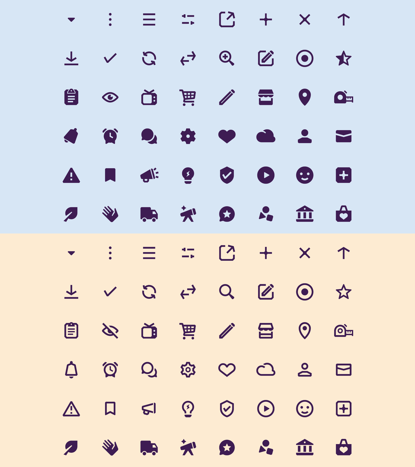
Icon set of both fill and outlined icons, as well as different states. Icons represent the gamut of things across Etsy, from "handmade", "sustainable", "vintage", "free-shipping", and functional navigation.

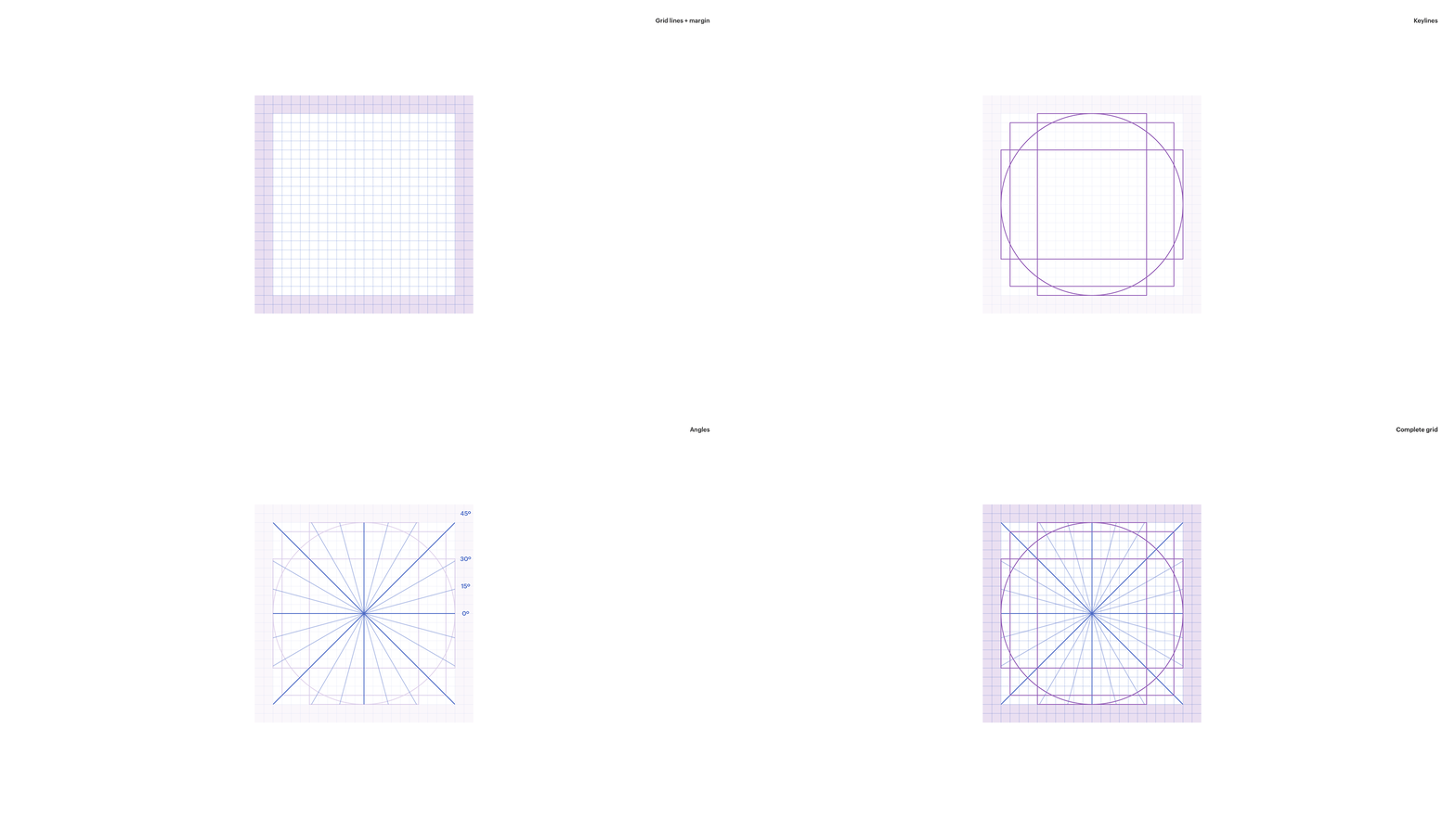
Etsy’s icon grid uses a 24px grid that is layered with a 2px margin, keyline shapes to ensure even icon color, and angles. By adding additional angles we gave more voice and opportunity for delight in the product.

Examples of keyline shapes to achieve consistency in scale.

Angles provided more room for play and creating an inviting and soft feel.

For icons with different states, optical adjustments are made without sacrificing meaning. In other cases, the 2px stroke rule becomes an exception to ensure the same overall weight.

Optical adjustments were made for different icon states. Using the grid, a cut-out effect is achieved using positive-negative space while being on pixel.

Making tweaks to scale by extending beyond the margins allows for certain icons to feel the same size while adhering to the rules.

Different active states for icons that are tapped, alerts, disabled, or have a sequential value.

Chamfered edges are made for finishing touches to create a cut-out feel that optically smooths out at smaller sizes. In some instances, opting to keep the sharp point if the angle is 90º or wider, or if anatomically it is better to opt-out.

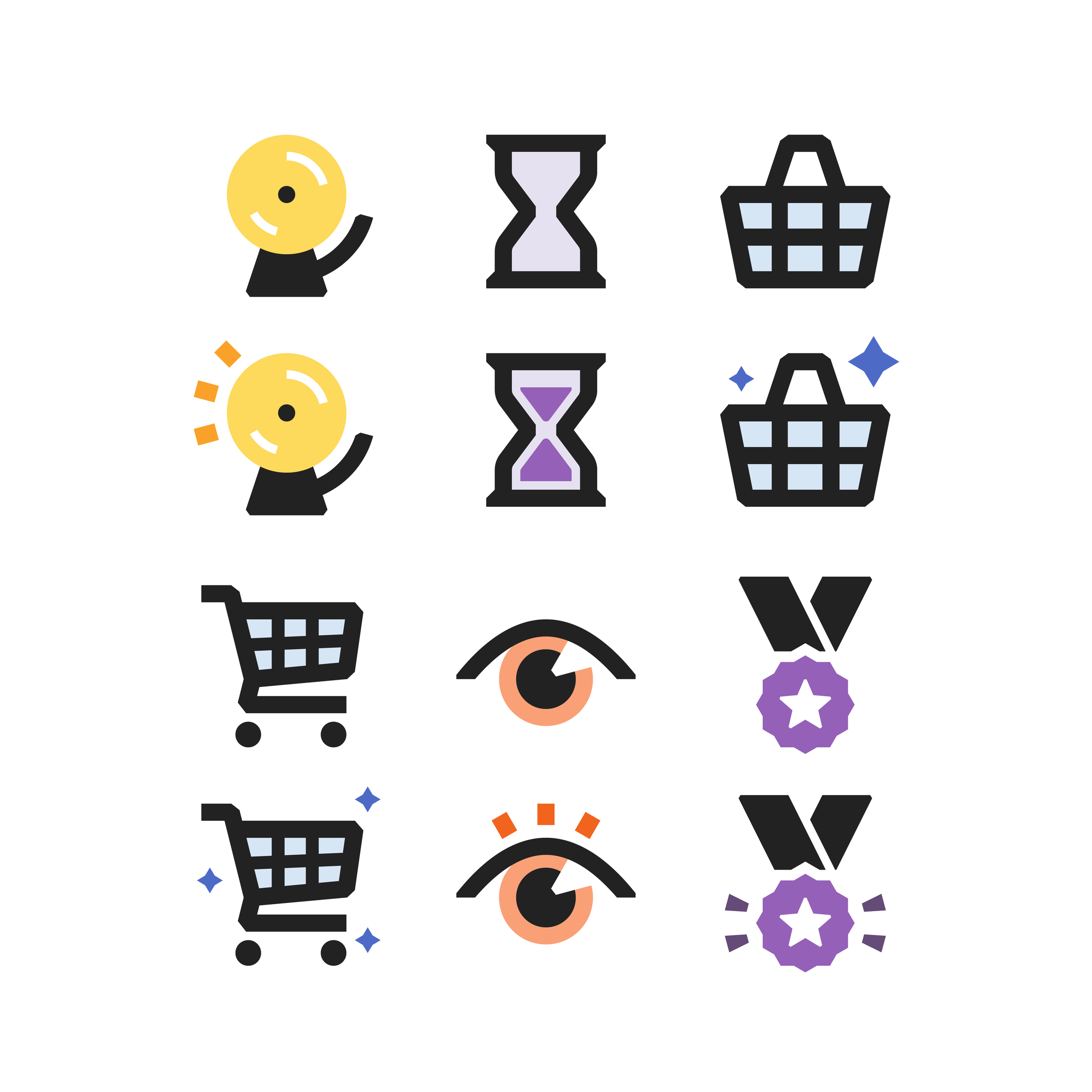
At larger scales, animated icons like signals and nudges have more color and energy while still adhering to the same grid. From left to right: Don’t Miss Out (only x left and y people have in their carts), Almost Gone (Only x left), Other People Want This (Basket-UK/International, Cart-US); Don’t Miss Out (other people are looking at this); Trusted Seller.
